Modernizing Learning at Global Scale
A decade-old training platform, rebuilt for a new generation of learners across every Apple Store.
Led the redesign of Apple's decade-old training platform by simplifying navigation, modernizing the experience, and creating scalable foundations for global learning.
My contributions
- Led UX for the learning dashboard, personalization model, and cross-device concepts.
- Ran audits and system studies that unified fragmented Classroom and Schoolwork surfaces.
- Designed accessible, inclusive patterns that were adopted into internal Human Interface guidance.
- Prototyped iPhone and Apple Watch companion experiences that shaped the education roadmap.
- Role
- UX Designer
- Client
- Apple
- Year
- 2018-2019
- Discipline
- Product, Learning
- Product strategy
- IA
- Design system
- Onboarding
Solution highlights
A learning home that feels personal, courses restructured around how retail teams actually learn, and an accessible reading experience built in from day one.
The problem
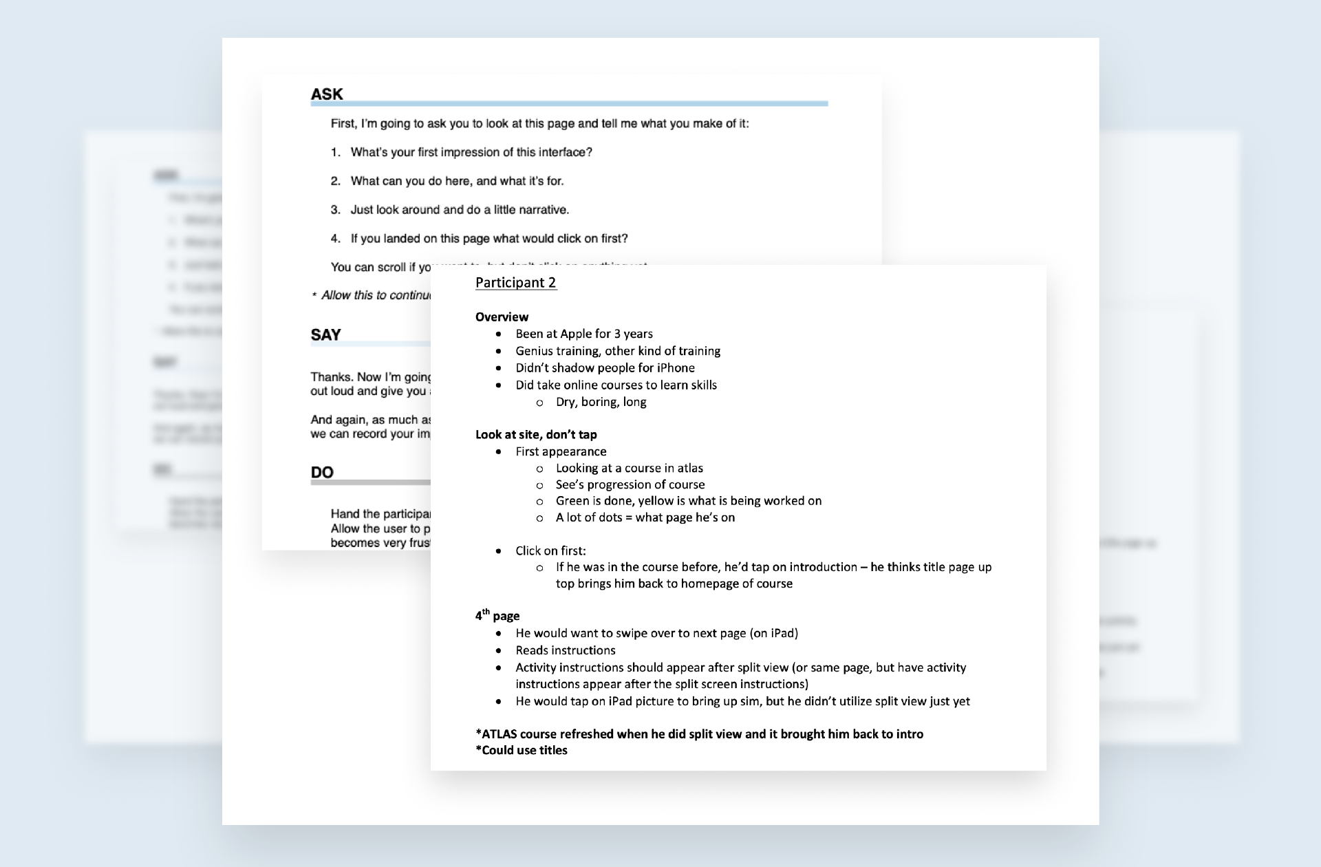
Atlas was Apple's global training platform, and after a decade of well-meaning additions it had become a maze. Retail employees struggled to navigate it between customers, and the team struggled to maintain it across 50+ markets. Every new feature made the old shape harder to see. I ran usability interviews with retail employees and partnered with internal learning leads to map workflows, accessibility gaps, and information architecture, finding where modernization would have the most leverage.
The insight
The biggest gains came from doing less. I pushed back on a louder visual redesign and argued for rethinking the structure first, navigation, IA, and the underlying system, so that every future feature would inherit clarity instead of adding to the mess. If we redesigned the surface and not the structure, we'd be back in two years.
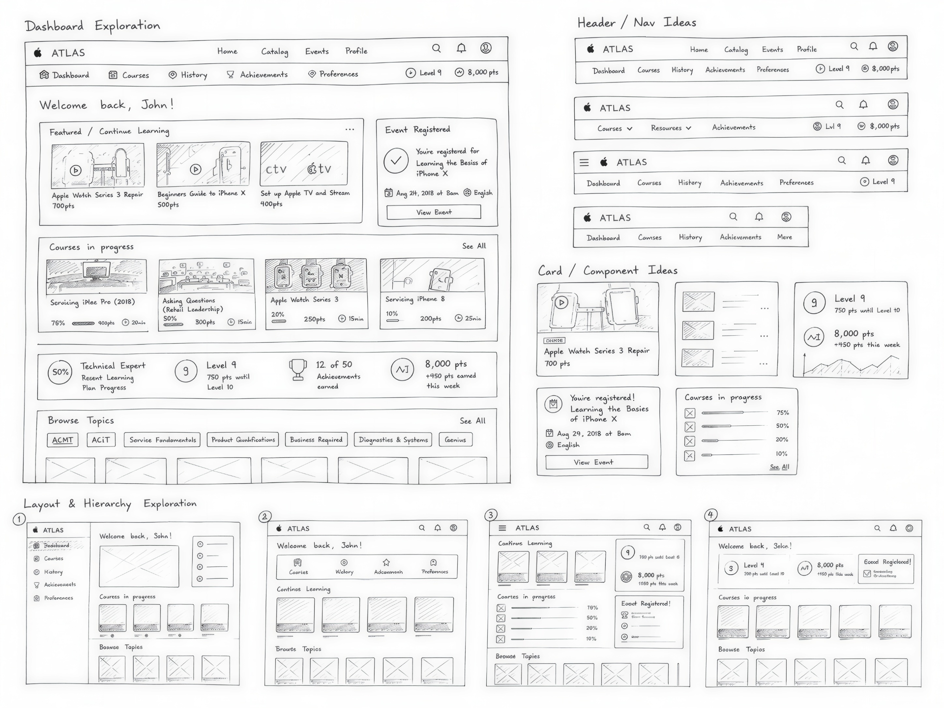
Explorations and iterations
Before pixels, I worked in sketches and component studies, dashboards, headers, personalization states, achievement patterns, figuring out hierarchy on paper. The most durable outcome wasn't the redesigned surface, it was the Atlas Design System underneath it: themable, accessible, localization-ready, and still the foundation the team builds on today.
Inclusive by default
I treated accessibility and localization as foundational decisions, not finishing touches. Every interaction was evaluated for inclusivity and global scale, so a redesign for one market was a redesign for all 50+. Designing for every retail employee, in every market, from the start.
A system built to outlive the redesign
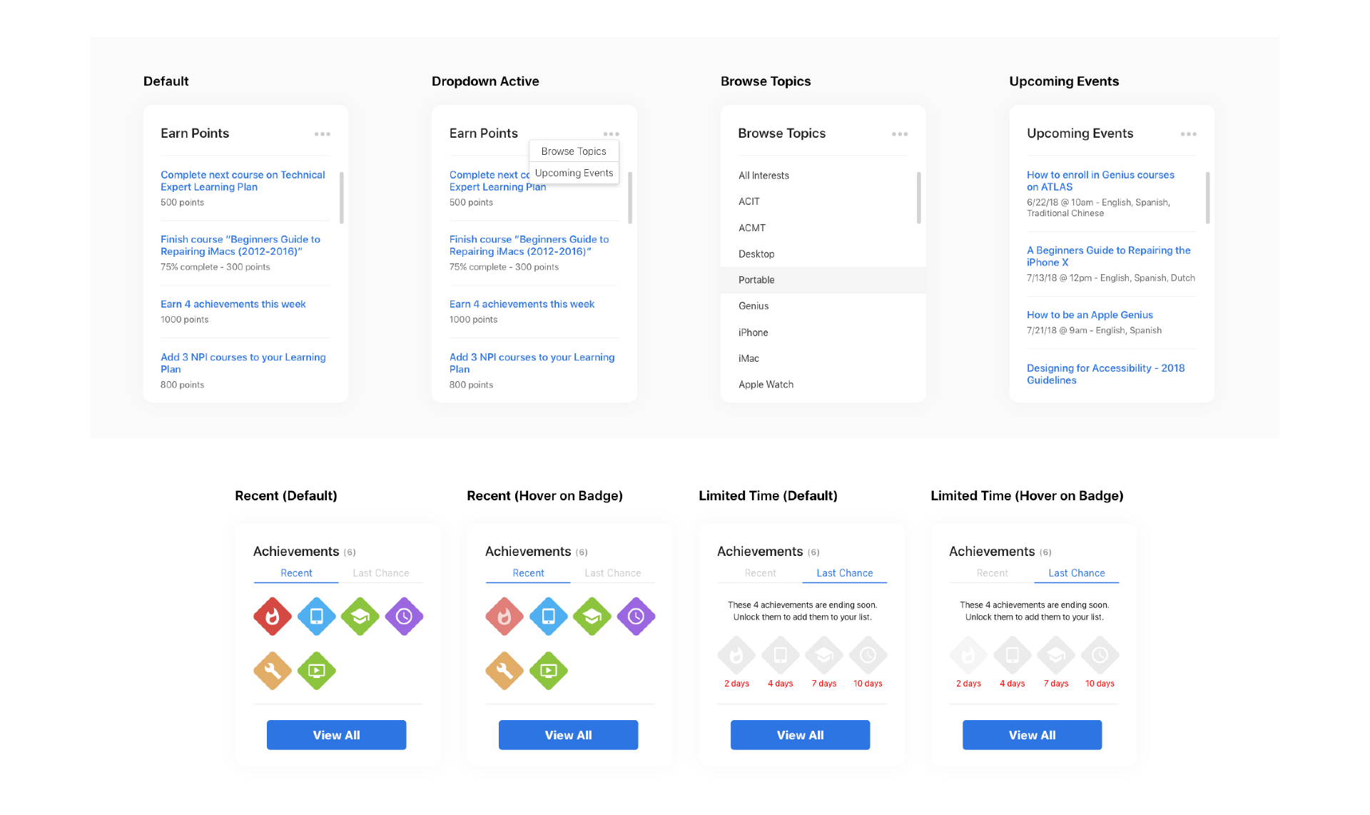
The work extended past screens into the patterns, components, and tokens the team continues to build on. I designed and built the Atlas Design System, a themable, accessible component library with light/dark modes, density controls, and a full icon set, so the most durable outcome wasn't the new platform, it was the foundation underneath it.
Atlas on the desktop
A closer look at how the redesigned Atlas comes together on the desktop, from navigation and discovery to in-context learning and the patterns retail teams use every day.
Deep dives
Feature highlights across the desktop experience
Selected flows from the redesigned platform, showing how structure, accessibility, and personalization play out at full scale.
The future of Atlas, beyond the desktop
Concepts that pushed the system into new surfaces, in-the-moment knowledge on iPhone and glanceable learning on Apple Watch.
What I learned
Architecture beats art direction
A bold visual redesign wears off in a release or two. Good navigation and IA compound. Fix the structure and every future feature inherits clarity.
Accessibility and localization are architecture
They're not a finishing pass. Treated as foundational decisions, they shape components and flows so a redesign for one market becomes a redesign for all 50+.
Systems outlast screens
The most durable deliverable was the Atlas Design System, a themable, accessible component library the team continues to build on years later.